In today’s fast-paced world, more than 50/70% (depending on the generation) of emails are opened on mobile devices. If you aren’t optimizing your emails for smaller screens, you risk losing engagement or frustrating your readers. Follow these best practices to ensure your emails are mobile-friendly and optimized for the best possible experience!
Responsive Design is Non-Negotiable
First and foremost, you need a responsive email design. It’s not enough for your emails to look good on mobile; they need to function well, too. A responsive design ensures that your emails automatically adjust to the screen size, offering a seamless experience regardless of device.
Keep it Simple – Less is More
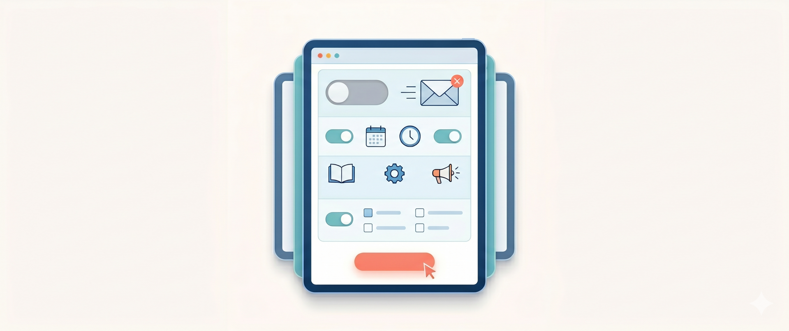
Mobile screens are smaller, so prioritize clean, clutter-free designs. A single-column layout is usually your best bet, allowing your content to flow naturally from top to bottom. Stick to short paragraphs, bold headers, and prominent calls-to-action (CTAs). Complex designs with too many columns or images can quickly overwhelm.
Font Size & Readability Matter
Avoid making your readers zoom in to read your email! The ideal font size for mobile devices is 14-16px for body text and 22-24px for headlines. This keeps your email legible and easy on the eyes without users needing to pinch and zoom.
Touch-Friendly Buttons
Mobile users rely on their thumbs for navigation, so your CTAs must be touch-friendly. Use buttons instead of text links, and ensure they’re at least 44x44px in size, with ample white space around them. No one wants to accidentally click the wrong link due to a crowded design.
Optimize Images & Load Times
Mobile users are often on the go, sometimes relying on slower connections. Compress your images to reduce load times but ensure they maintain high quality. Use “alt text” for all your images, so that users on slow connections or image-disabled environments still understand the context.
Visual Hierarchy for Easy Scanning
Make sure your emails are skimmable. On mobile, users are quick to scroll, and they won’t read every word. Use a visual hierarchy with clear headings, subheadings, and bulleted lists to make your email content easy to digest at a glance.
Preheader Text – The Silent Hero
Your preheader text can be just as important as your subject line, especially on mobile. Preheaders are the snippets of text that appear next to or under the subject line in the inbox preview. Use this space to support your subject line, and further entice the recipient to open the email.
Test on Real Devices
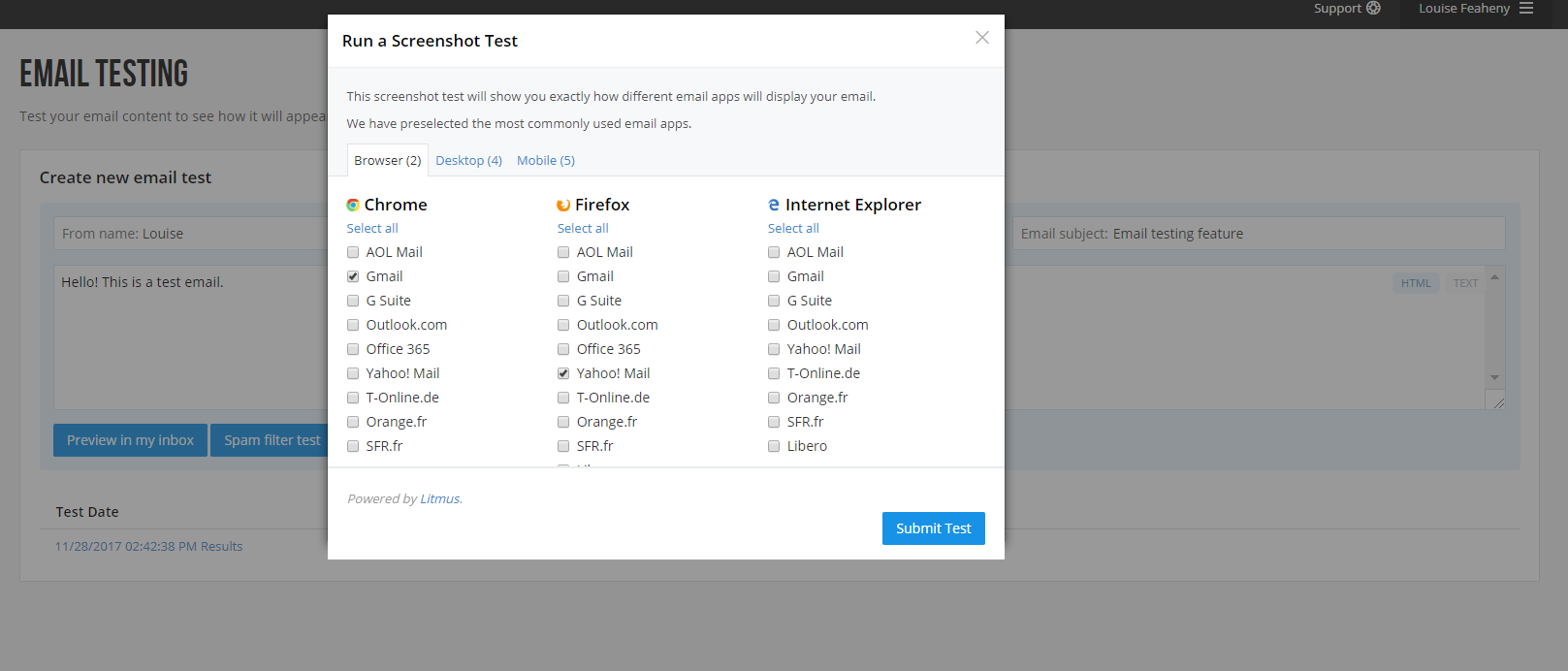
Simulating your design on a desktop screen isn’t enough. Always test your emails on actual mobile devices to catch any rendering issues before sending them to your list. Nothing beats viewing the email on a real phone, however, if that sounds like a lot of hassle, don’t worry, we have an easier option. Check out the Email Testing feature on your SMTP2GO dashboard to see how emails will appear on different mail clients, in the browser, on a desktop, and on a mobile device.
Dark Mode Compatibility
More mobile users are switching to dark mode on their devices. Ensure your email design doesn’t break when viewed in dark mode. Some design elements might need tweaks to remain legible, like avoiding pure black backgrounds and using transparent images instead of those with white backgrounds.
Code for Performance
Heavy code can slow down load times, especially on mobile networks. Clean up unnecessary code and avoid using heavy HTML elements like embedded media. Focus on lightweight CSS for formatting and consider switching to web-safe fonts to avoid external server calls.
Design for “Thumb Zone” Accessibility
Consider the natural way people hold their phones. Most users hold their devices with one hand, and the thumb does most of the navigation. Ensure your key interactive elements like buttons and links are placed within easy reach of the thumb for a more ergonomic and user-friendly experience.
Include Clear and Obvious Unsubscribe Links
Mobile devices make everything feel closer and faster—this includes unsubscribing from your emails. Don’t hide your unsubscribe link; it’s required by law (hello, CAN-SPAM Act) and improves your sender reputation. Make it easy to find and mobile-friendly!
By incorporating these tips, you’ll be well on your way to ensuring that your emails look fantastic, are easy to interact with, and -most importantly- engage your audience effectively on mobile devices.
About the author
Louise Feaheny
Louise Feaheny has been a Customer Success Engineer at SMTP2GO since 2015, spending the last decade walking customers through provider selection, SMTP setup, and the messy reality of troubleshooting deliverability once they're live. She helps guide people through the decision-making process, setup and troubleshooting, and she's a regular voice in the emailexpert.org community.
